Writing out the content of my portfolio.
The Content
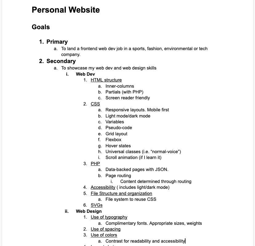
First we wrote out the goals and content for our site. What do we want to achieve with our personal site and what are it’s intentions? Mine of course is to showcase my work and ultimately help me get a job as Web Developer.
We need to know what we’re going to fill our site with before we start building it. For some reason this was a hard concept for me to grasp. It felt like I was furnishing a house before it's getting built. When building out a site, it’s easier to build when we know the size and amount of content. For example what will the header titles be? Will it be a couple long words or a bunch of short words? Once we have a good idea of the content, then we can start designing the site around the content.
Writing out the content of my portfolio.
Content In Context
Next we started creating some designs with a bit of content. This helped us visualize how we wanted the content to sit on the page or within the modules. This allowed us to explore different ways to display the content. I focused primarily on the Project Cards. I had a pretty good idea of how I wanted to display the info so I mocked up how it might appear on mobile and desktop.
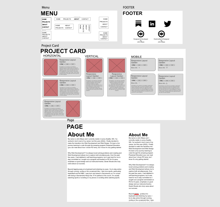
Adding some visual context with the content I wrote out.
Type Detail
We spent an entire day playing with type design. First we picked out a few font styles we would potentially use. I ended up with a sans-serif font called, Rubik. I like it because it has a lot of different weights to choose from and it has a business casual feel. It’s straight, but the edges are slightly rounded, which makes it a bit more approachable than something like Arial.
Once we figured out our font style, we tried different ways to display header and paragraph text. I experimented with a lot of different styles and variations of line-spacing, column widths, font weights and header shapes. I tried everything from a header that sat on a wavy line to one that runs along a corner. It was fun to try different styles and combinations, but I ended up going with the traditional horizontal header over a block of text.
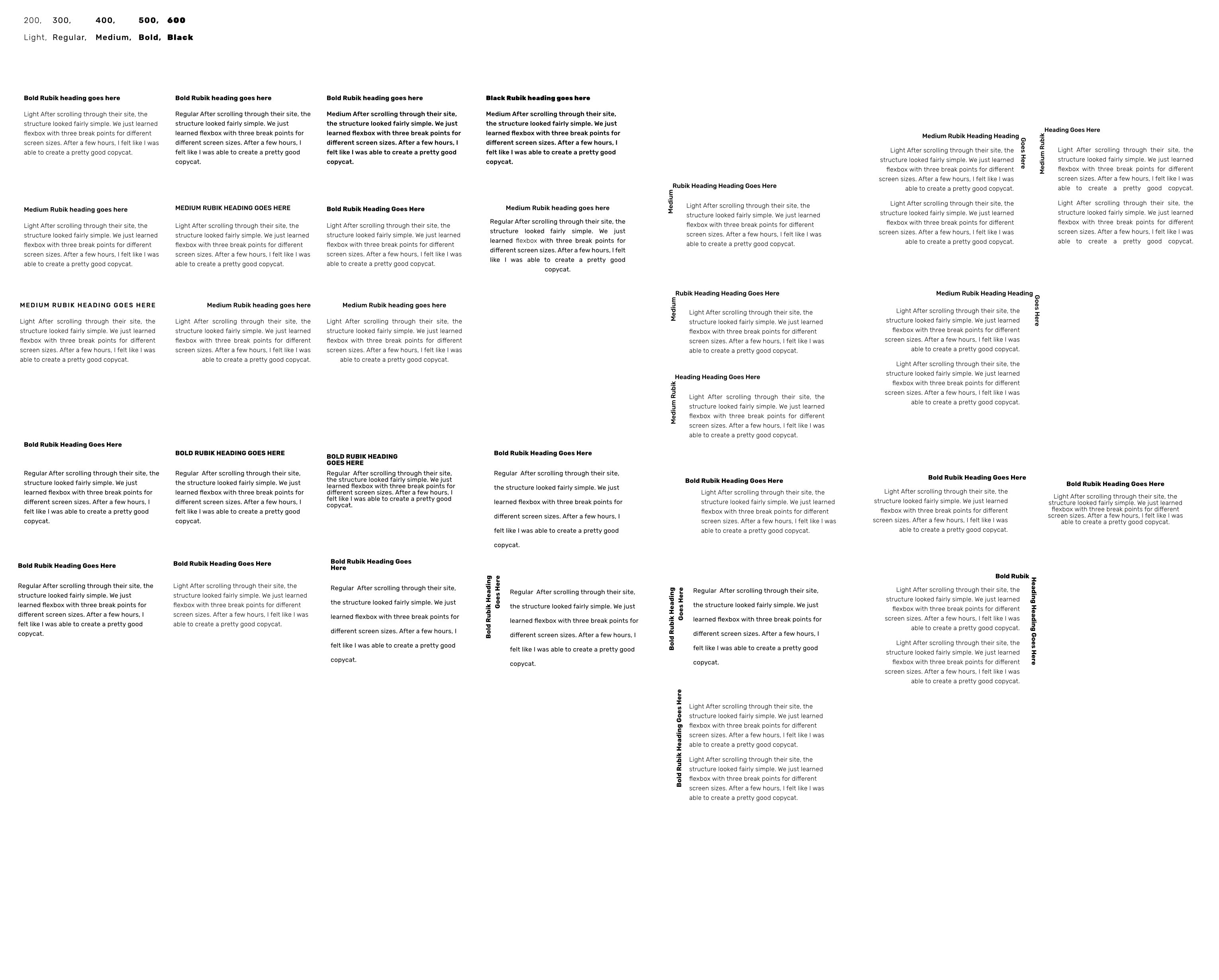
Trying different variations of the header and paragraph. Played with line spacing, font weights, text-alignments and more.
Design Inspo
Now it was time to create mockups of our site in Affinity Designer. When the options are limitless, it’s hard for me to start. I knew I didn’t want a traditional top down site with a header, main, and footer. While I still have those three components, I wanted it to be “different” than your normal business style website. I was actually inspired by the very first part of this site wokine.com. I liked how the page was divided. I decided I would incorporate that division throughout my portfolio. I went through numerous iterations of each page with different fonts (yes, I changed my mind on it a few times).
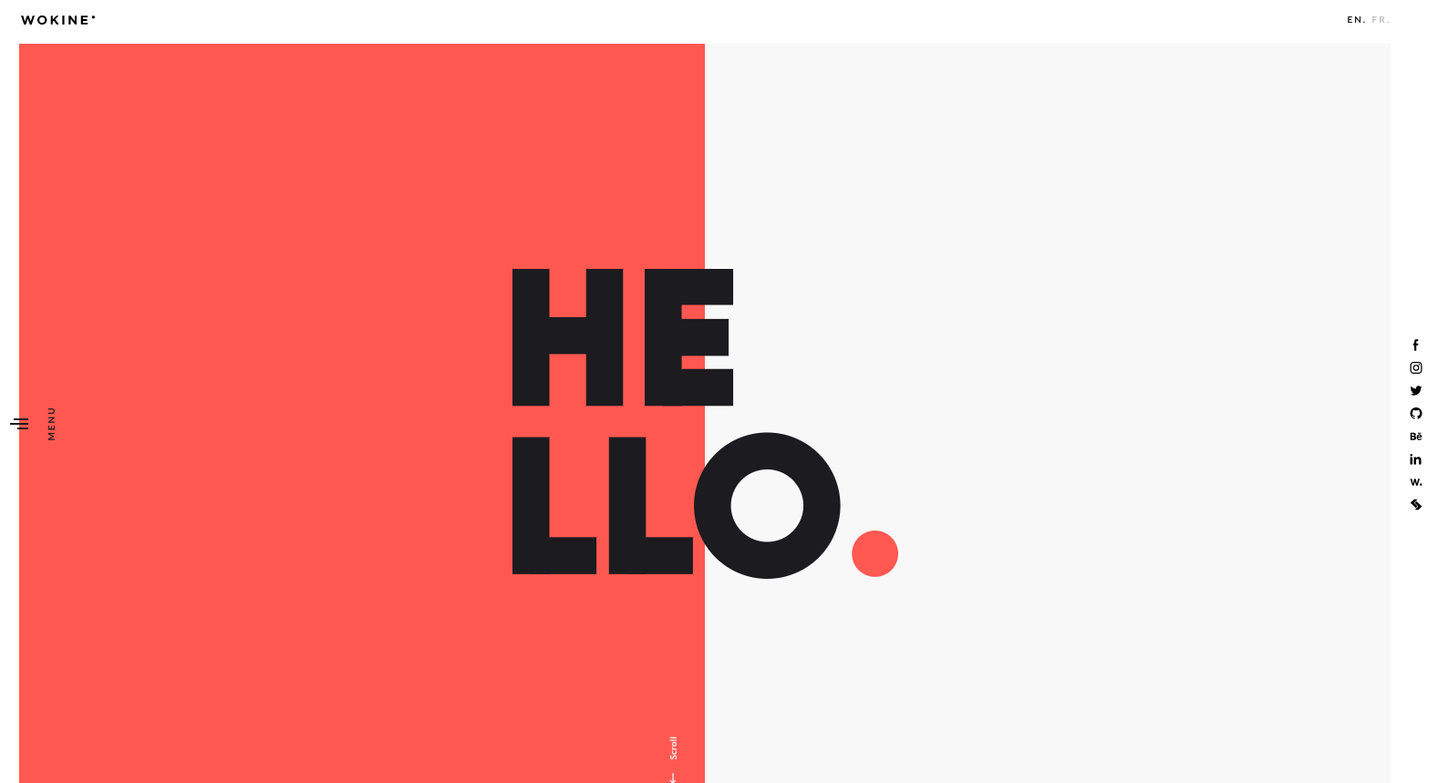
Screenshot of Wokine homepage
Layout on the Grid
Once I felt good about my layout it was time to actually build it…but how? I really struggled with how I was going to build it because of my unique layout (unique to me at least). I went into Codepen to try to figure out how I was going to get this split background using grid. I tried several different ways, but none of them achieved what I wanted. I was actually close to giving up and just switching to a traditional layout, but after talking to my mentor, Derek, he let me know I can do whatever I want to make it work. Ah ha! I was trying to build my unorthodox layout using the traditional blueprint we’ve been taught. Once I let that go, I was able to get a bit more creative with my solution and create my layout exactly how I envisioned it!
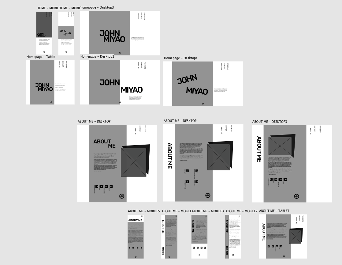
Mockup of my site in Affinity Designer accounting for different screen sizes.